Chapter 3 Introduction to ggplot2
The package ggplot2 is extremely functional and useful. It created graphs in layers and therefore is very intutive. It adds layers on top of each other
3.1 Creating the building blocks of the graph
ggplot(data = dataname, mapping= aes(x=xaxis, y= yaxis))
ggplot function from ggplot2 package requires two arguments: data is the object name you gave to your data sets Mapping is the specifications of the variables we want to visualize and are places withing the ‘aes’ function short for aesthetics.
Let’s bring back the chick data and let’s look how chicks have grown over time
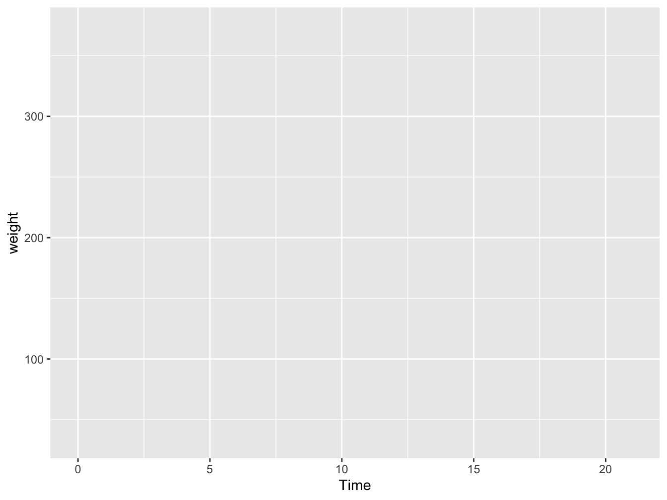
Figure 3.1: Building block
We see a box, and we see the correct axis but we don’t see anything else- why?
3.2 Adding geom_objects
Because yes we told ggplot what variables we want to plot, but we haven’t told it what type of plot we want. We can do this by adding a ‘geom_object’. For this purpose, let’s make a line plot. We can do so by adding a ‘geom_line’ object to the previous layer. We join the two layers by a ‘+’ sign.
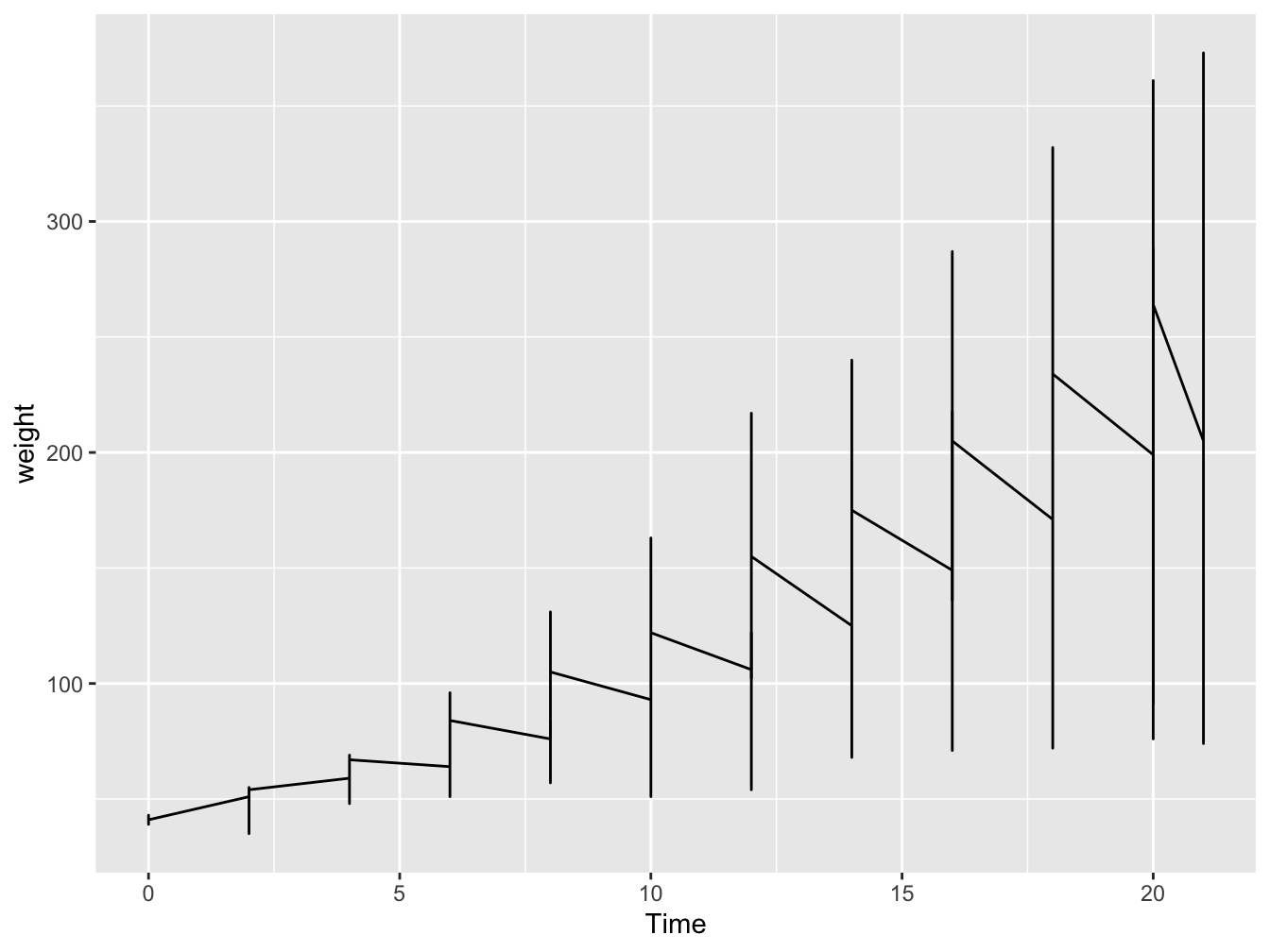
Figure 3.2: Line plot
Hey! We got some lines, but it looks weird!!! That is becasue we plotted all the data together, we had 48 chicks but we plotted all of them in the same plot. So let’s make them distinct. We can simply do so by giving a distinct line to each chick by adding group
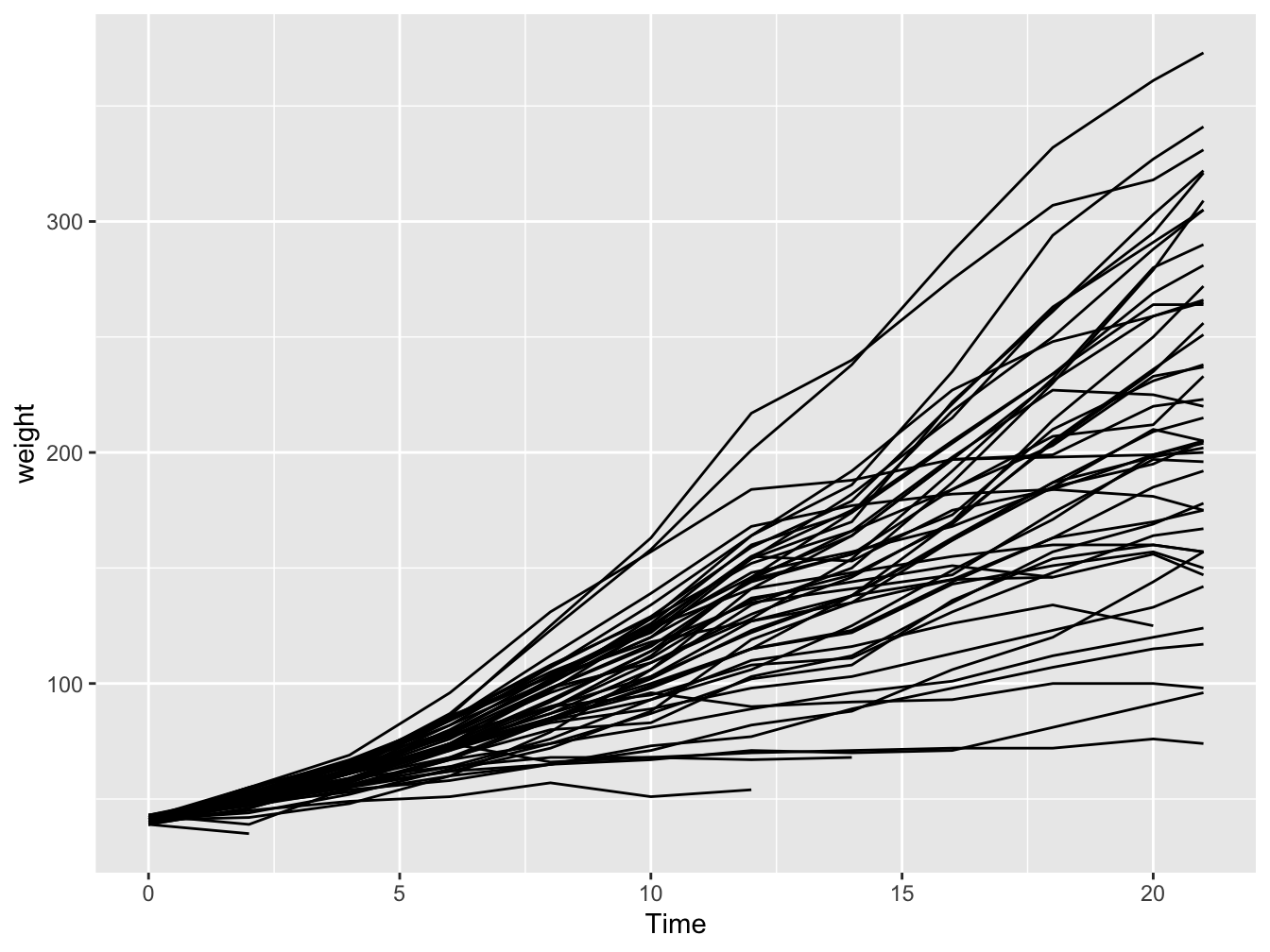
Figure 3.3: Line plot with colors
3.3 Making the plot visually more appealing
Let’s do the following: 1. Increase the size of the lines 2. Lighten the background using the theme function in ggplot2 3. Increase the size of axis text and titles 4. Change y axis label
library(ggplot2)

ggplot(ChickWeight, aes(x=Time, y=weight, group=Chick),size=2)+
  geom_line()+
  theme_minimal(base_size = 20)+
  ylab("Weight")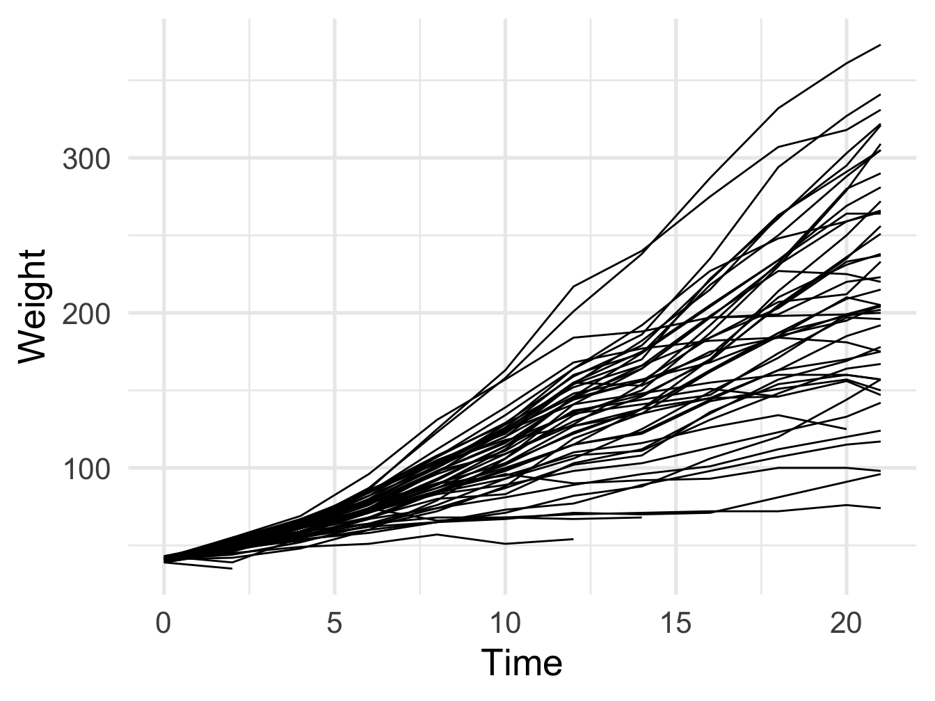
Figure 3.4: Better looking line plot with groups
3.4 Let’s make the plot colorful
ggplot(ChickWeight, aes(x=Time, y=weight, color=Chick),size=2)+
  geom_line()+
  theme_minimal(base_size = 20)+
  ylab("Weight")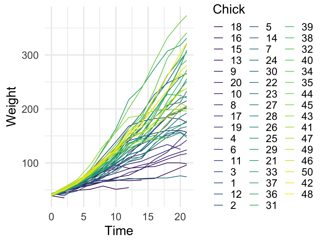
Figure 3.5: Better looking line plot with colors
3.5 Change label fonts, color, angle etc
ggplot(ChickWeight, aes(x=Time, y=weight, color=Chick),size=2)+
  geom_line()+
  theme_minimal(base_size = 20)+
  ylab("Weight")+theme(axis.title.x = element_text( angle=40,vjust=0.2,color='blue',family="Comic Sans MS"))+
  theme(axis.title.y =  element_text( color='purple',family="serif"))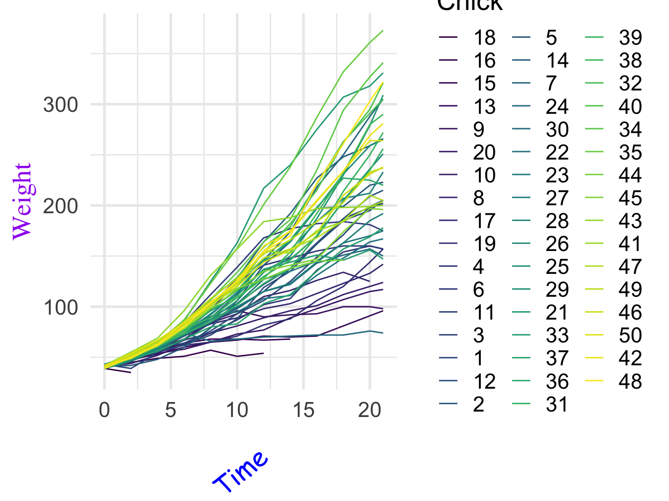
Figure 3.6: change label font
3.6 You can also create and save a theme for entire project
theme_set<-function(){ theme_bw(base_size = 20)+
    theme(axis.text.x = element_text(angle=35,vjust=0.8,color='green'))+
    theme(legend.title = element_blank())}


ggplot(ChickWeight, aes(x=Time, y=weight, color=Chick),size=2)+
  geom_line()+theme_set()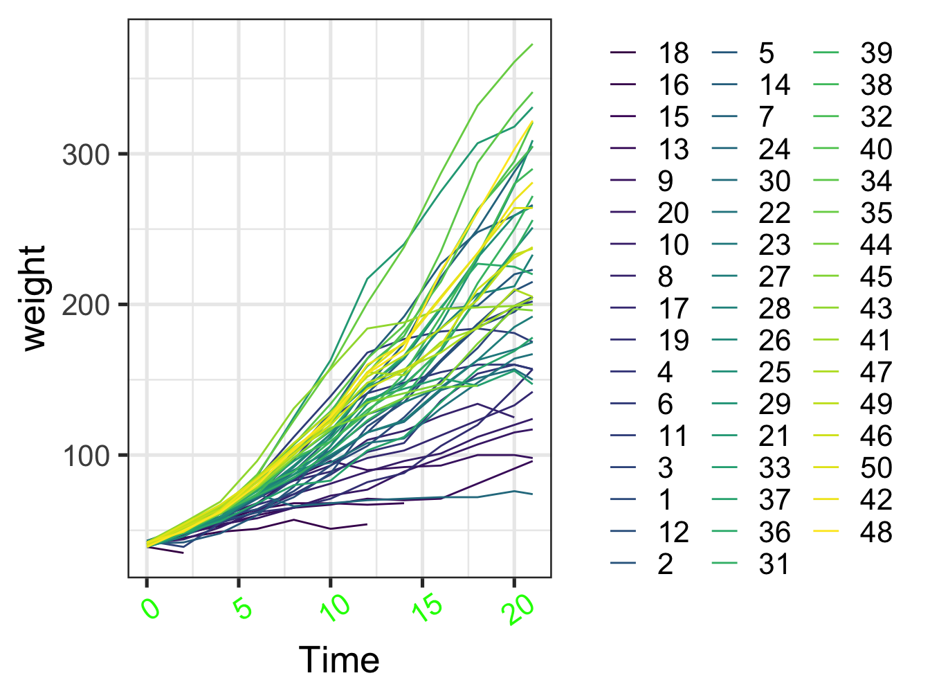
Figure 3.7: change label font
3.7 Changing colors manually and add error bars
Lets plot the mean chick weight over time for each type of diet
ChickWeight %>% group_by(Diet,Time) %>% mutate(mean.wt=mean(weight),
                  se.weight= (sd(weight)) / sqrt((length(weight)))) %>%
                 ggplot() +
              geom_line(aes(x=Time, y=mean.wt, color=Diet,lty=Diet),size=2)+
            geom_ribbon(aes(x=Time, ymax=mean.wt+se.weight,ymin= mean.wt-se.weight,group=Diet,fill=Diet),size=2,alpha=0.2)+
              scale_color_manual(values=c("cyan1","cyan4","green","orange"))+
            scale_fill_manual(values=c("cyan1","cyan4","green","orange"))+
              ggpubr::theme_pubr(base_size = 20)+
                ylab("Mean weight")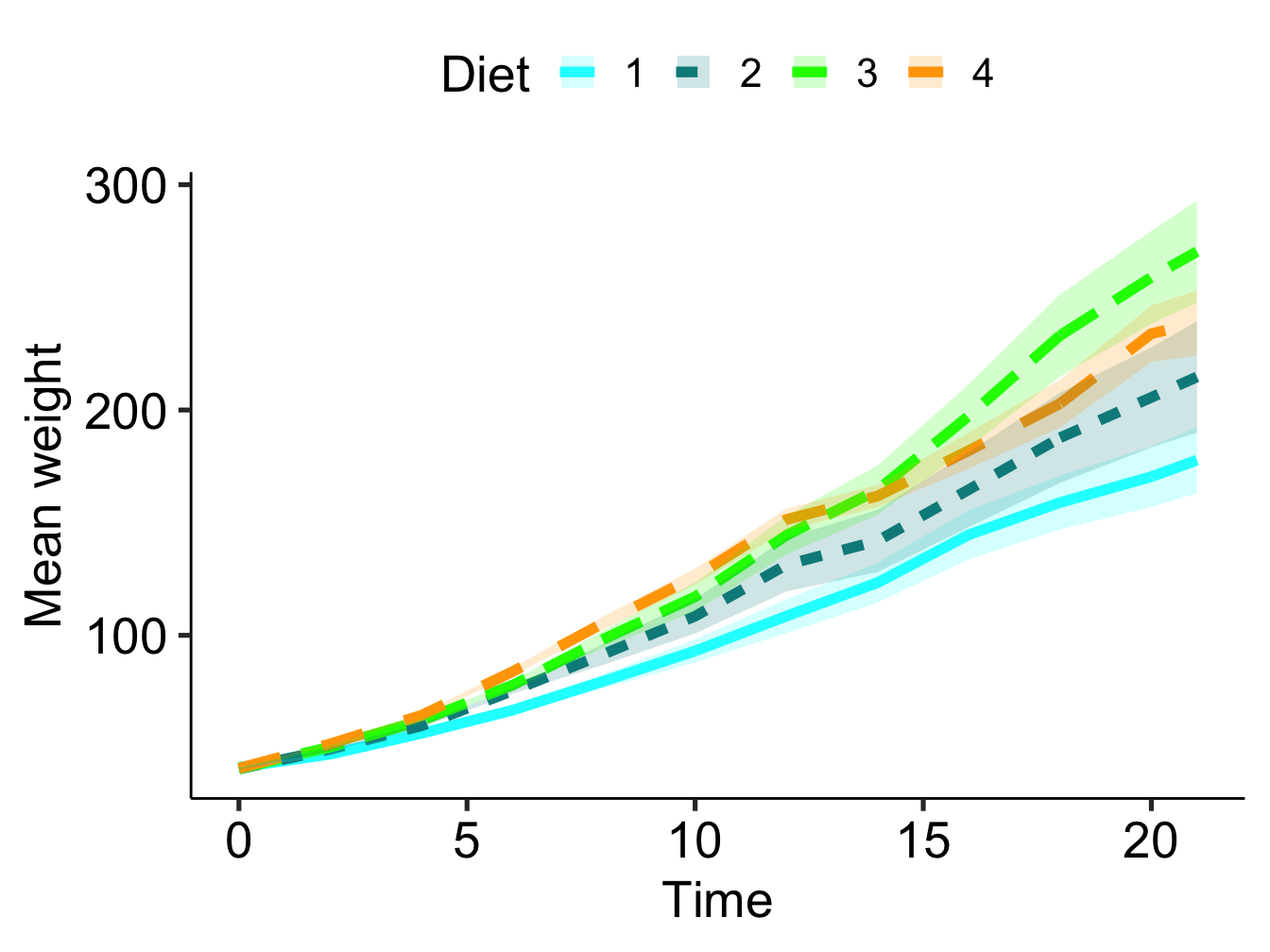
Figure 3.8: change label font