Chapter 4 Plotting using one variable at a time
4.1 Histograms- plots the distribution of a numerical variable
Note the customizations of the histogram: 1. we colored the bars pretty 2. ‘alpha’ adds transparency to the object, useful when you have overlapping objects, goes from 0 (transparent) to 1 (opaque)
library(ggplot2)

ggplot(ChickWeight, aes(weight))+
  geom_histogram(fill='cyan4',color='black',alpha=0.5)+
  theme_minimal(base_size = 20)+
  ylab("Frequency")+ xlab("Weight (g)")
## `stat_bin()` using `bins = 30`. Pick better value with `binwidth`.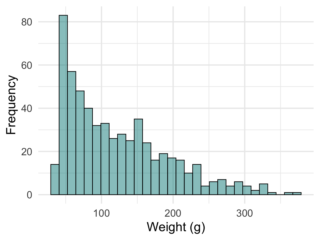
Figure 4.1: Histogram
Improving ‘binwidth’ value, it is the number of categories data is divided into and usually defaults to 30, but we can go up and down, let’s go to 50 here
library(ggplot2)

ggplot(ChickWeight, aes(weight))+
  geom_histogram(fill='cyan4',color='black',alpha=0.5, binwidth = 50)+
  theme_minimal(base_size = 20)+
  ylab("Frequency")+ xlab("Weight (g)")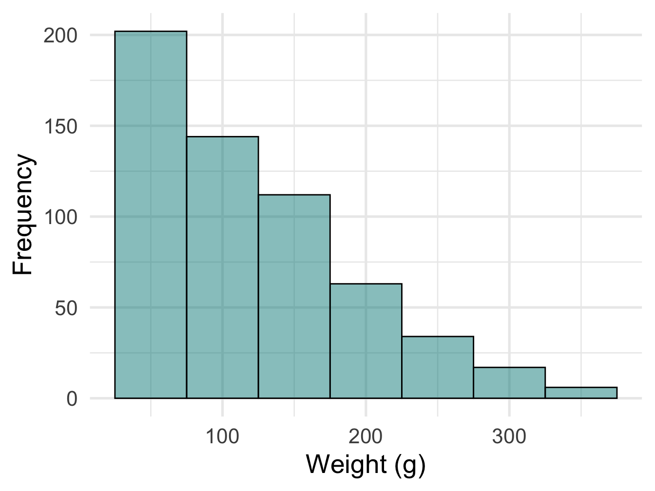
Figure 4.2: Histogram
4.2 Bar plots
Plot the distribution of a categorical variable
Here we will plot number of chicks following a particular diet.
library(ggplot2)

ggplot(ChickWeight, aes(x= Diet))+
  geom_bar(color='orange', fill='lavender')+
  theme_minimal(base_size = 20)+
  ylab("Count")+ xlab("Diet")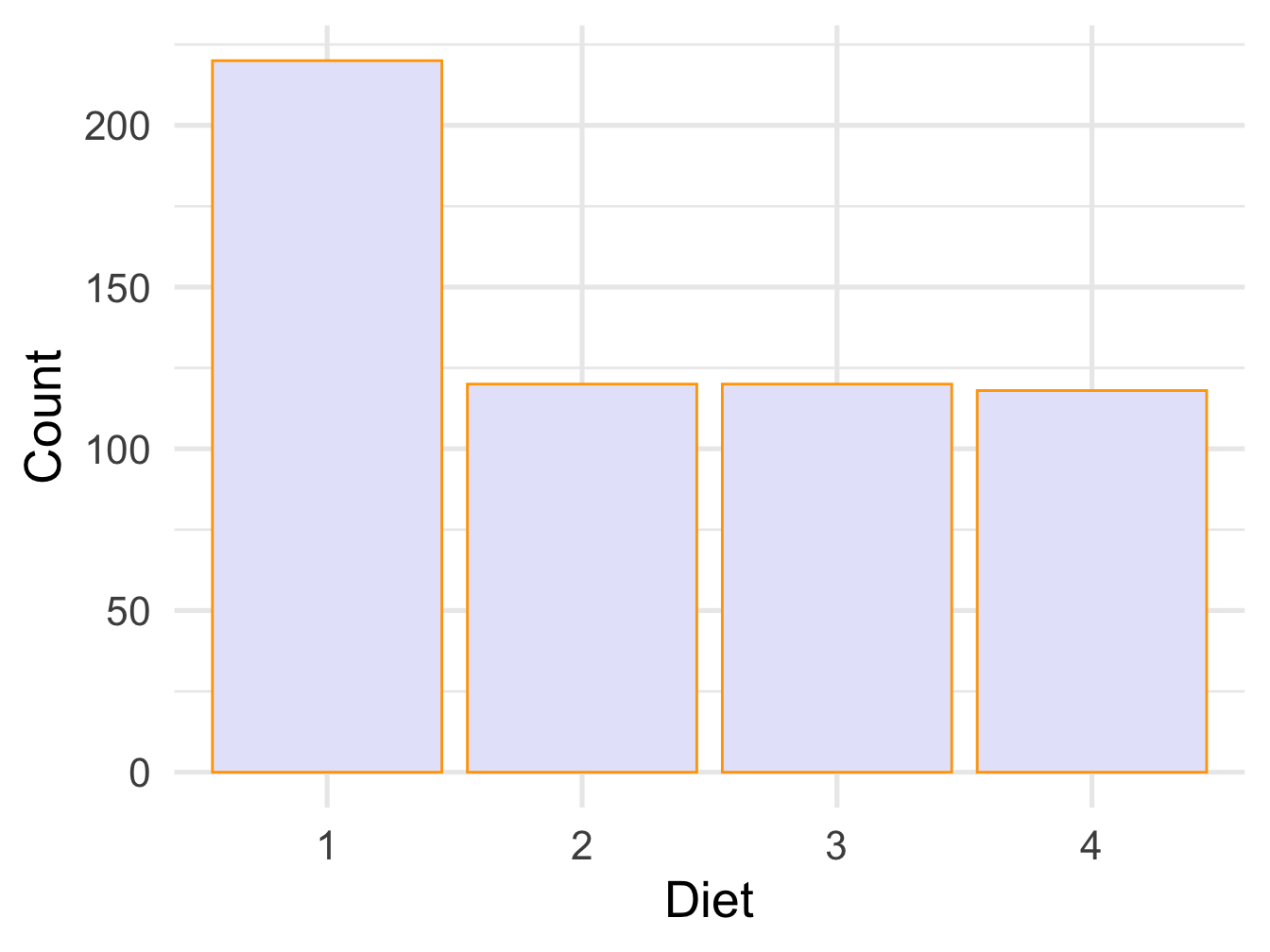
Figure 4.3: Bar plot
4.3 Ordering based on number of counts from lowest to highest
Let’s bring the magic of dplyer to do so
So we reorganize the data to calcualte number of chicks on each diet type
##   Diet   n
## 1    4 118
## 2    2 120
## 3    3 120
## 4    1 220
Here we plot using geom_col function where heights represents the value of the data and requires y aesthetics. We can use geom_text function to add the label to each column and use vjust to move the labels up and down
library(ggplot2)

ggplot(reord.chick, aes(x= reorder(Diet,n), y=n))+
  geom_col(color='orange', fill='lavender')+
  geom_text(aes(label=n), vjust=-0.7)+
  theme_minimal(base_size = 20)+
  ylab("Count")+ xlab("Diet")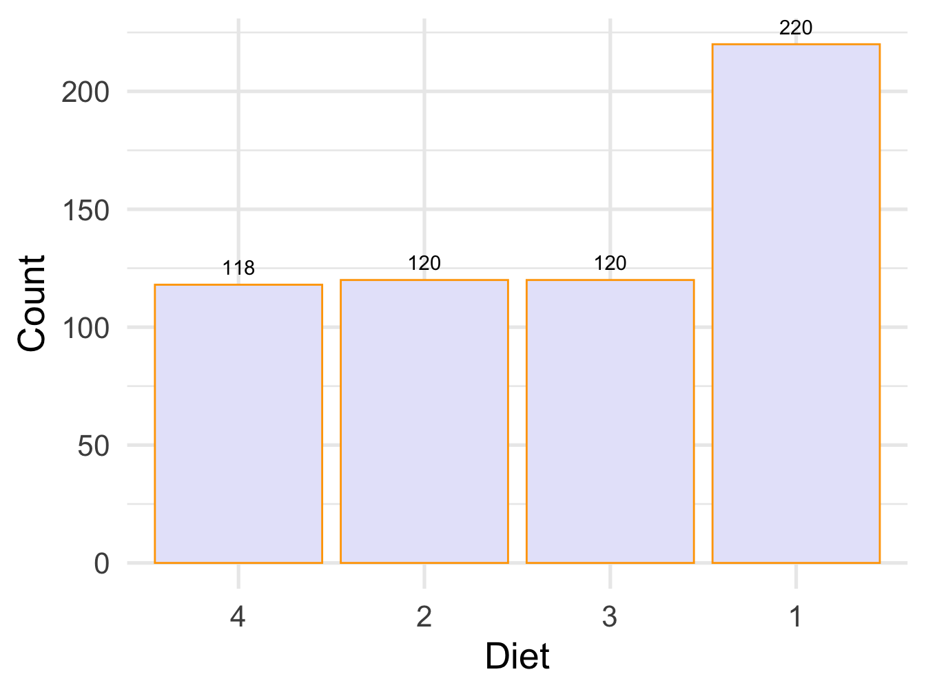
Figure 4.4: Bar plot with labels
4.4 Adding percentages
Here we also get more adventerous with data wrangling and create new columns and plot them within the same pipe
ChickWeight %>%
  count(Diet) %>% arrange(n) %>%
mutate(percent = n / sum(n),
         percentlabel = paste0(round(percent*100), "%")) %>%

ggplot( aes(x= reorder(Diet,percent), y=percent))+
  geom_col(color='orange', fill='lavender')+
  geom_text(aes(label=percentlabel), vjust=-0.7)+
  theme_minimal(base_size = 20)+
  ylab("Count")+ xlab("Diet")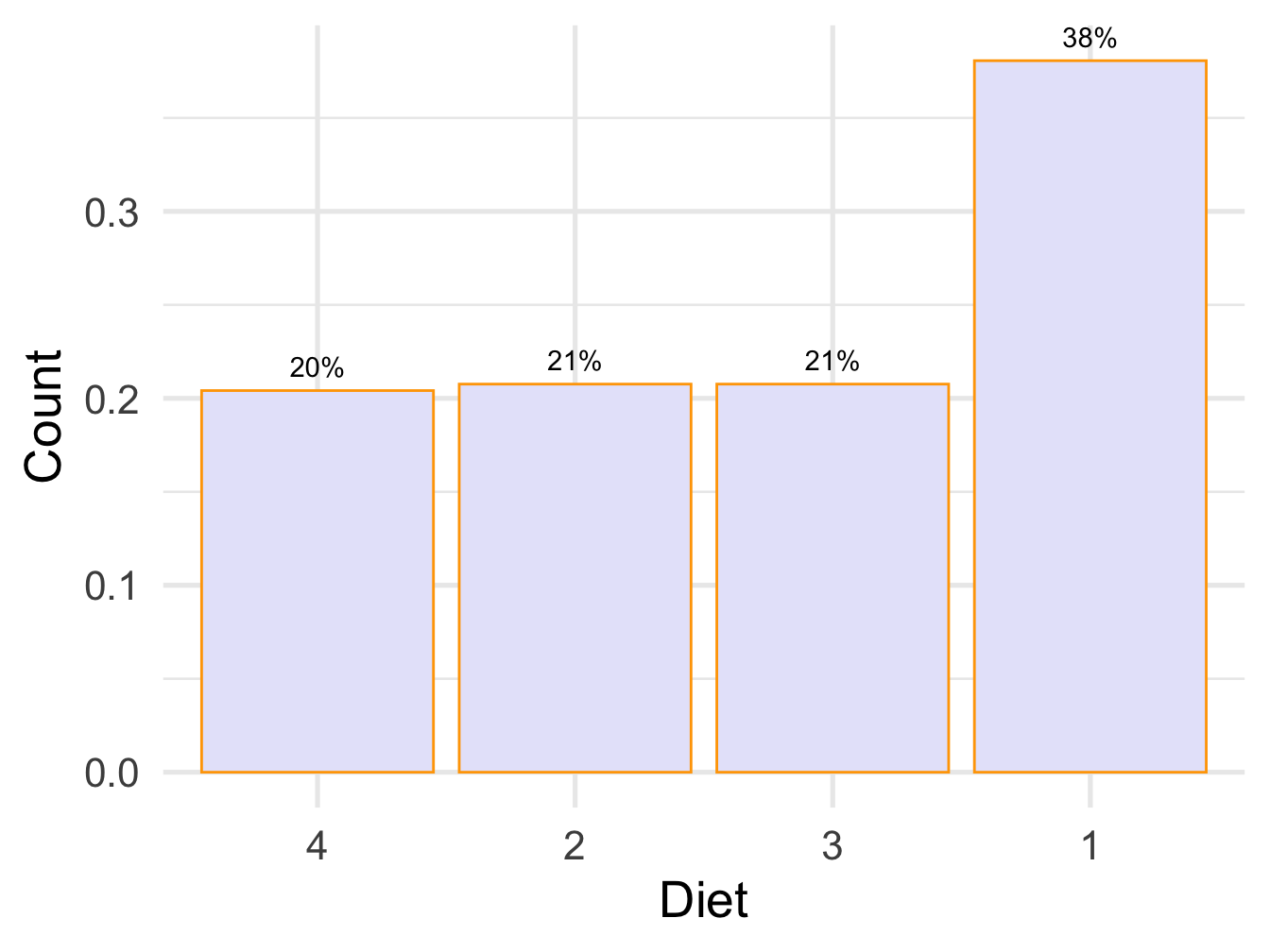
Figure 4.5: Bar plot with percent labels
4.5 pie chart
library(ggplot2)

ggplot(reord.chick, aes(x= reorder(Diet,n), y=n,fill=Diet))+
  geom_col(width = 1,
           stat = "identity",
           color = "black") +
  geom_text(aes(label=n), vjust=-0.7)+
  theme_minimal(base_size = 20)+
  coord_polar("y",
              start = 0,direction = -1
              ) +
  theme_void() +
  ylab("Count")+ xlab("Diet")
## Warning: Ignoring unknown parameters: stat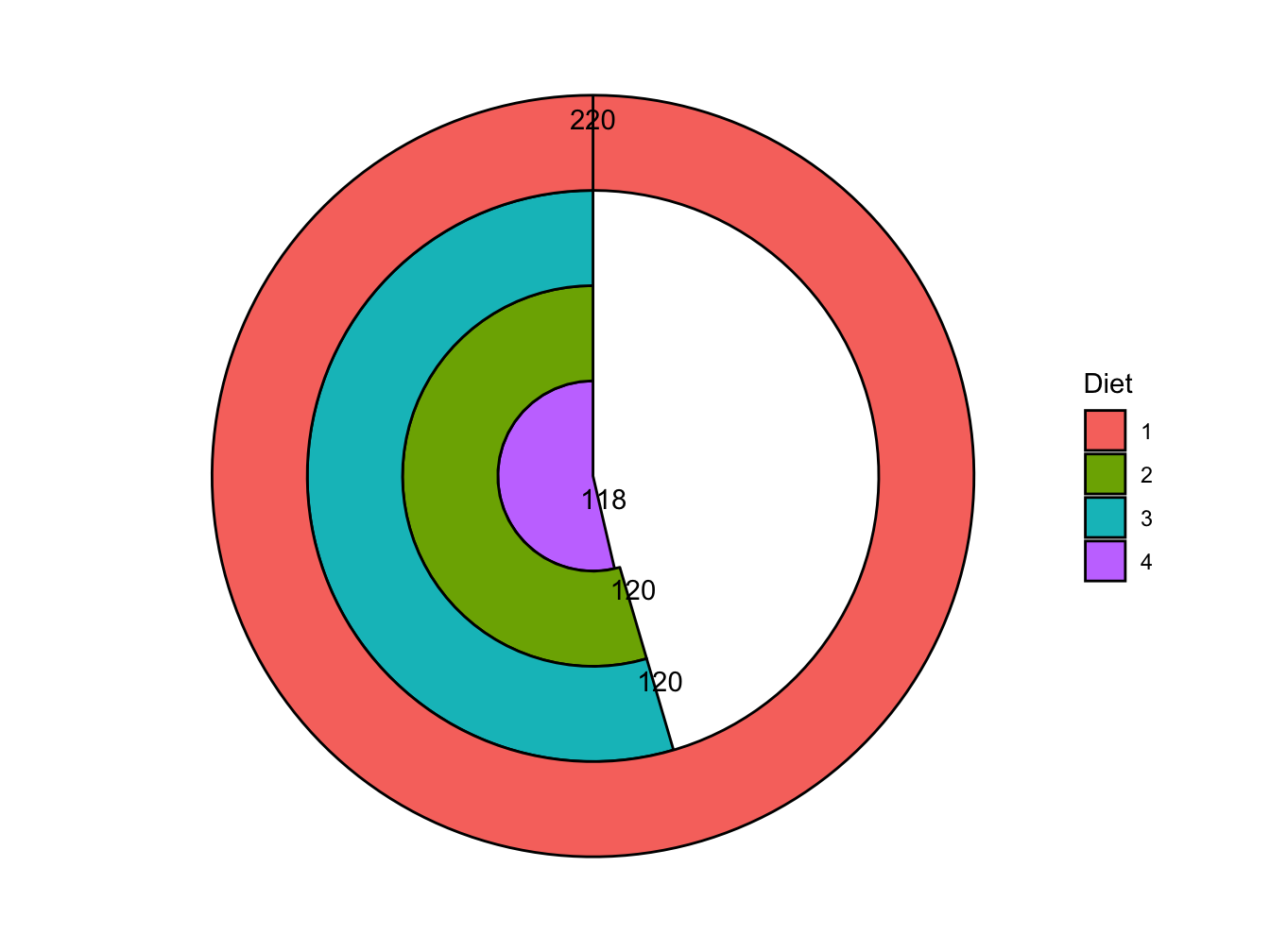
Figure 4.6: Pie chart with labels