Chapter 5 Multivariate plotting
Now we will plot using multiple variables
Let’s use diamond dataset from tidyr
## # A tibble: 6 x 10
##   carat cut       color clarity depth table price     x     y     z
##   <dbl> <ord>     <ord> <ord>   <dbl> <dbl> <int> <dbl> <dbl> <dbl>
## 1 0.23  Ideal     E     SI2      61.5    55   326  3.95  3.98  2.43
## 2 0.21  Premium   E     SI1      59.8    61   326  3.89  3.84  2.31
## 3 0.23  Good      E     VS1      56.9    65   327  4.05  4.07  2.31
## 4 0.290 Premium   I     VS2      62.4    58   334  4.2   4.23  2.63
## 5 0.31  Good      J     SI2      63.3    58   335  4.34  4.35  2.75
## 6 0.24  Very Good J     VVS2     62.8    57   336  3.94  3.96  2.48
5.1 Bar plot with categories, plot depth by cut
ggplot(diamonds)+
 geom_bar(aes(x= cut, fill=color))+
  theme_minimal(base_size = 20)+
  ylab("Count")+ xlab("Cut")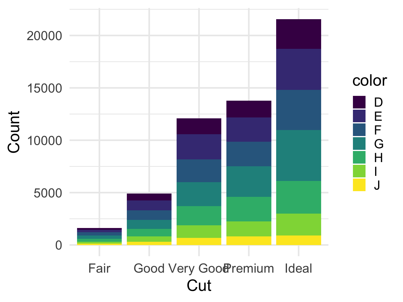
Figure 5.1: Bar plot with grouping
5.2 Bar plot with categories, side by side
ggplot(diamonds)+
 geom_bar(aes(x= cut, fill=color),position = position_dodge())+
  theme_minimal(base_size = 20)+
  ylab("Count")+ xlab("Cut")+
  scale_x_discrete(guide = guide_axis(n.dodge = 2)) # when the axis text are overlapping, this can help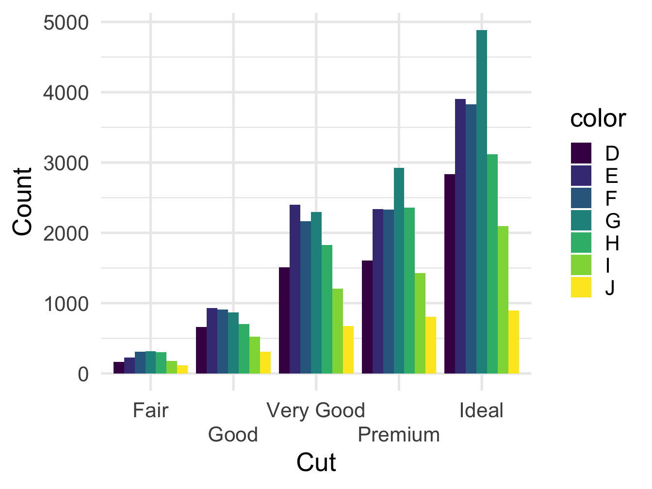
Figure 5.2: Bar plot with grouping
5.3 Segemented bar plot, appealing viz
diamonds %>%
  group_by(cut, color) %>%
  summarize(n = n()) %>%
  mutate(prct = n/sum(n),
         label = scales::percent(prct)) %>%
         ggplot()+
          geom_col(aes(x=cut,y=prct,fill=color),position='fill')+
          geom_text(aes(x=cut,y=prct,label = label),
            size = 3, color='white',
            position = position_stack(vjust = 0.5)) +
             theme_minimal(base_size = 20)+
  ylab("Percentage")+ xlab("Cut")
## `summarise()` regrouping output by 'cut' (override with `.groups` argument)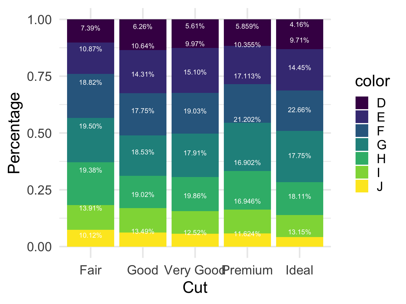
Figure 5.3: Bar plot with segments
5.4 Scatter plot
ggplot(diamonds)+
geom_point(aes(x=carat,y=price,color=color))+
  theme_bw()+
  xlab("Carat")+ ylab("Price")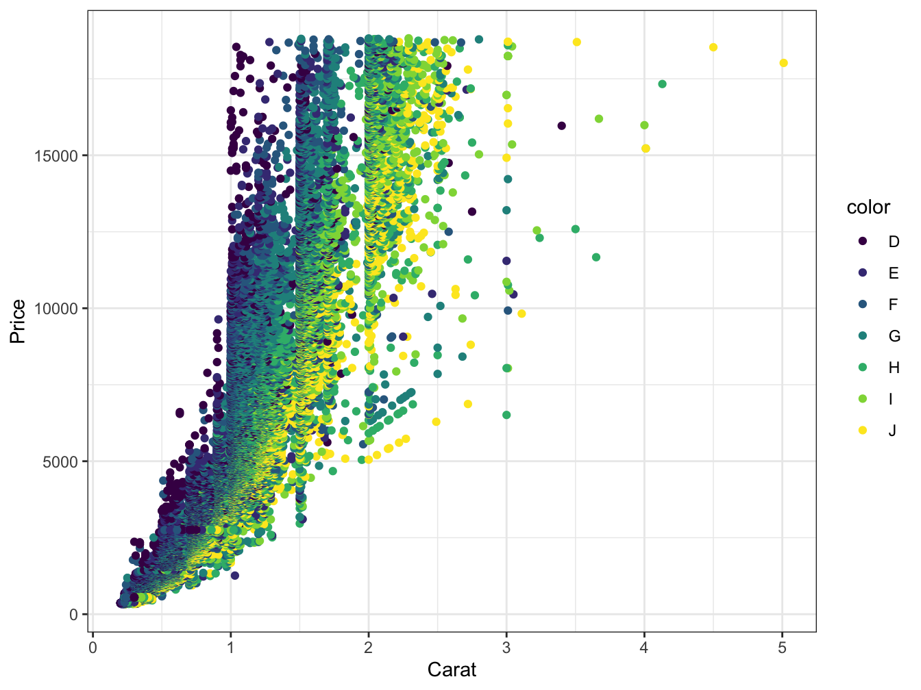
Figure 5.4: Scatter plot with grouping
Let’s see if the Carat is related to price
         ggplot(diamonds)+
          geom_point(aes(x=carat,y=price,color=color))+
  geom_smooth(aes(x=carat,y=price,color=color),method='lm')+
  theme_bw()+
  ylab("Carat")+ xlab("Price")
## `geom_smooth()` using formula 'y ~ x'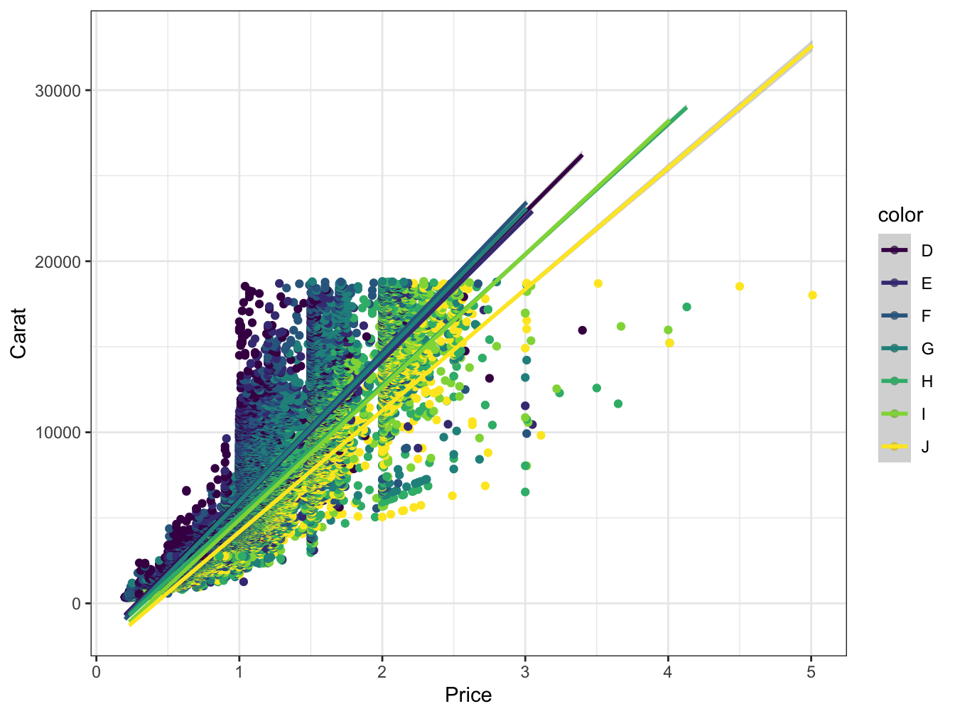
Figure 5.5: Scatter plot with grouping and smooth line
5.5 Grouping using facets
         ggplot(diamonds)+
          geom_point(aes(x=carat,y=price))+
  geom_smooth(aes(x=carat,y=price),method='lm')+
  facet_wrap(~color)+
  theme_bw()+
  ylab("Carat")+ xlab("Price")
## `geom_smooth()` using formula 'y ~ x'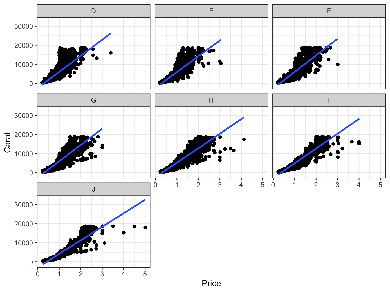
Figure 5.6: Scatter plot with facets and smooth line
5.6 Change facet labels
## [1] "D" "E" "F" "G" "H" "I" "J"diamonds2$color<- factor(diamonds2$color, levels =c("D" ,"E" ,"F" ,"G", "H", "I", "J"),
labels=c("Red","Blue","Orange","Pink","Indigo","Jade","Orange"))
ggplot(diamonds2)+
geom_point(aes(x=carat,y=price))+
geom_smooth(aes(x=carat,y=price),method='lm')+
facet_wrap(~color)+
theme_bw()+
ylab("Carat")+ xlab("Price")## `geom_smooth()` using formula 'y ~ x'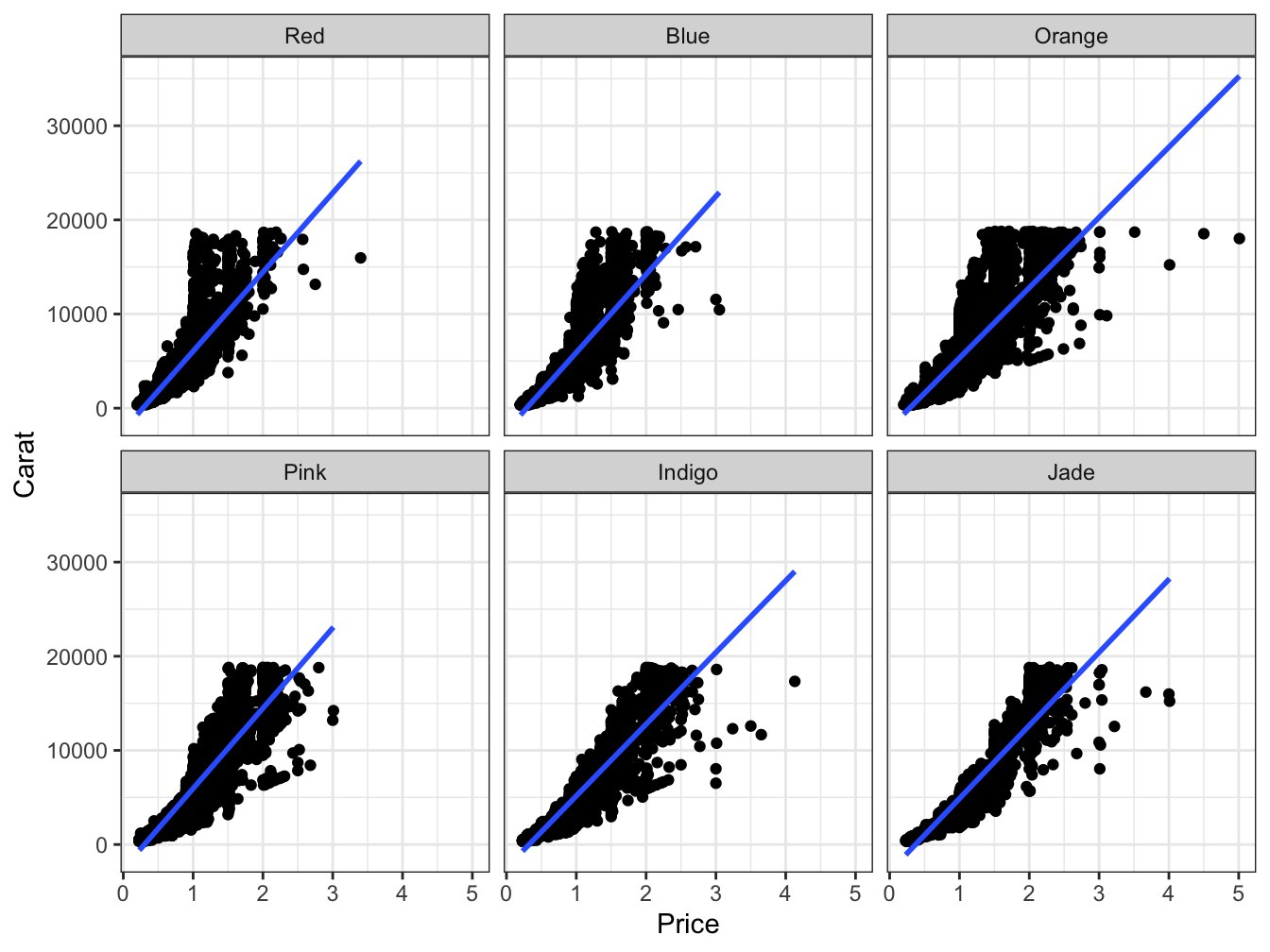
Figure 5.7: Scatter plot with facets and different labels